27 July 2010

HAND-DRAWN MAP ASSOCIATION

If you've ever scribbled a map for somebody - perhaps the directions to a keg party, the location of an amazing cafe, or the sexiest way home (?), you'll appreciate The Hand-Drawn Map Association.

As budget and probably embarrassingly poor as they may well be; these humble maps are quietly celebrated as necessary parts of a vibrant life...
life, oh life, ooooh life
doo, doo doo doo
doo, doo doo doo


20 July 2010

EMERGENCY EMERGENCY

The USA Department of Homeland Security sure do know how to make maps that resemble a scene from Donnie Darko!  ....no, not really (I wish) but in this 4min video clip you get a sweet glimpse of the future of real-time mapping and information dissemination techniques.
How can you not click here to watch?!


13 July 2010

MOUSE MAP

Do you ever wonder what a map of all of those tiny little computer-mouse movements of yours would look like over time? Do you ever wonder why exactly you've developed Repetitive Over-use Syndrome in your wrist? No?  Well, don't not wonder no more!... At IOgraphica.com you can download some sweet software to see a map of every little compiled movement!

06 July 2010

FRACTAL ROYALE

In yet another of my random fossikings on the Internet, i stumbled across these sculptures of wind direction, and intensity and I was greatly satisfied for some inexplicable reason.  I think I know now the answer to that glee - you see, one of my secret pleasures in life is investigating fractals (recurring patterns in nature) and I was reminded of the similarity between these patterns of wind movement (albeit human generated) and other patterns found in nature. Which patterns? - You decide in this little game I call fractal royale!  (mouse-over the image for the answers displayed in the bottom bar of the screen)


This little guessing game may seem inconsequential at first, but the human ability of drawing similarities between (usually) relatively random things can lead us to use one tool for another task - and potentially advance human development.  Does the medical profession know about the advances in the mapping world and vice versa?  If this fractal world offers scalable answers perhaps one day I'll know if its possible for the grooves of a fingerprint to be played like the grooves of a record!

29 June 2010

GOAAAAAAAAAAAL

The football world cup is on at the moment so what better way to provide a beautiful insight into the beautiful game than with some choice interactive mapping visualisations (Cool if you're into soccer, probably lame if you're not)
And...
Next time you're watching a game of football perhaps you could ponder the supposed pinnacle of human acheivement...  in 1969, two astronauts landed on the moon and managed a light jog around their own half!
click here to look at this map in more depth

22 June 2010

CRAPPY MAPPY

Ok, dont ask what inspired this week's theme...
Oxfam's poo mapping project is a simple little idea that is directly helping local people.  I like this tangible humanitarian story - maps helping people, thats what this mapping malarky is all about really.
Penguins need help too, and if you're into monitoring penguin habitats (like your hero Mogan Freeman) but you're not into actually braving the sub-zero temperatures to do it, you may want to consider remote sensing poo mapping.


And, in much lighter news... Some say these particular crop circles were created by aliens, marking good spots in the galaxy to 'touch down' others say its a hoax - but if its on google maps its worthy of inclusion here.
By the way, this has nothing to do with maps but did you know in Mexico City they have sewer divers?!  Crap-ola!!!

15 June 2010

SCRIBBLEY DOODLEY

I'm not too sure what to say about these really..are they valid? are they maps?  I don't know! but the website Fake is the new real is putting them down so I'm picking them up.

These three links are probably my favourite bits from the site:

Click on this link to see subways from around the world all presented at the same scale.  They remind me of spiderwebs or perhaps even aliens.


The elegant doodle to your left is the result of tracing one year's worth of cycling and walking around New York.  Pretty simple, but who needs complicated?!


And if you're still with me (good for you!), these selected cities have had their streets split out and then piled on top of each other at their centroid points - creating star-like oddities.

08 June 2010

FUNNY - HA HA

If someone from the future had come back in time and told me that quite a few of the maps featured on ChoiceMapTuesday would turn out to be humourous, I would have laughed (ironically) at them. Yet, for some reason that I cant fully explain, the seemingly vapid cartographic form can quite often be.. funny ha haThese fanciful maps created by Christoph Niemann conveniently back me up. 

PS If there is anyone from the future out there, I'm also hoping you could tell me where I left my Swiss Army knife?!  I really miss it!  Though I  guess you could probably only tell me that its still lost?!  rats!!

01 June 2010

THE REAL OIL

Aghast and somewhat ignorant at the specific extent and impact of the current Gulf of Mexico oil-spill, I took to fossicking around on the internet for answers.  In this quest, I rummaged through a plethora of emotive photos (like these) until I honed in on this relatively unassuming photo of protective oil-spill booms that surround a few small islands off the coast of Louisiana.


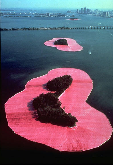
The photo seemed to me to be eerily similar to an iconic work of art from the early 1980s whereby a couple of industrious artists created amazing large-scale sculptural installations.  These bright pink installations were intended as a sort of a visual metaphor for the way in which we live between the ocean and the land. The seemingly abstract work conceptualised a very real conservation desideratum (thank you thesaurus!)


(sorry if all this is boring, my interest in buffer zones is possibly more piqued than most through my work in GIS where I mundanely buffer objects on a computer screen - to see them in the wild, so to speak, is nerdishly exciting for me)
If all this arty rhetoric is too obscure for you, just play with this interactive oil-spill model. It maps potential spill events near Vancouver, but in general terms it helps visualise fluid movement (and the black plague of human destruction upon this fair planet)

Lastly, I don't want to overload you, but you really should check out this little Google WebApp that overlays the oil slick with a location of your choosing.

25 May 2010

THE OTHER SUSAN

In a perfect(ly projected) world, Susan Stockwell would be more popular than Susan Boyle - unfortunately though, the world sucks. Regardless of this sad fact, you still need to know about her truely epic oeuvre of arty maps.

 
(PS  If you enjoy these arty maps, why not have a look at some other artists featured on my posting The art of maps )